SATELLITE DATA MAP SERVICE
Synspective
Land Displacement Monitoring Service
UI/UX Design
Synspective is a Tokyo-based satellite engineering and data service providing company. Their main goal is to provide accurate satellite data solutions for decision-making in business, construction, and governments.
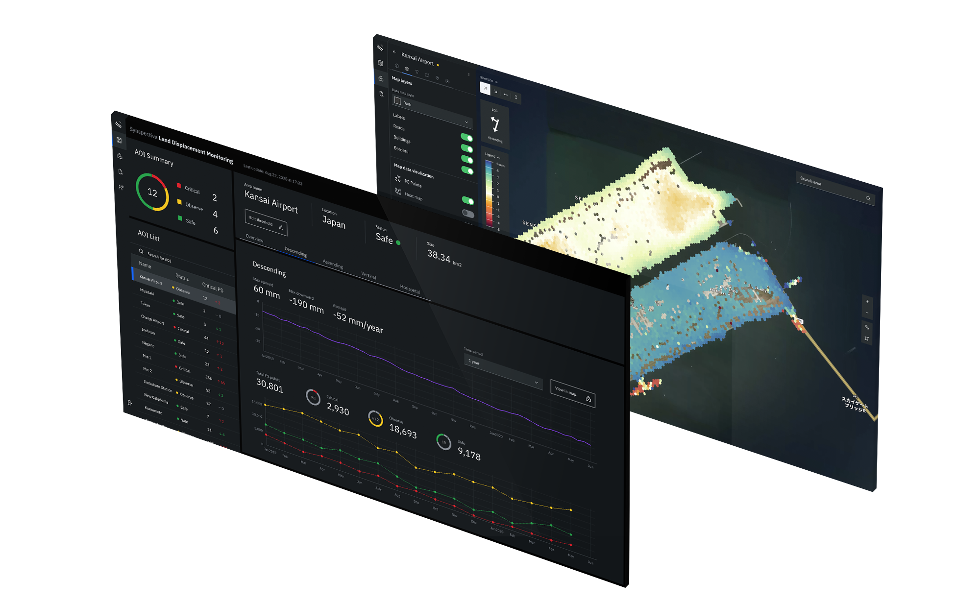
Land Displacement Monitoring (LDM) is a service that helps the user understand what areas are affected by severe land sinking and land displacement.
On this project, I was responsible for the overall design and user experience.
Design Brief
Land displacement is a geological phenomenon that can threaten any kind of territory in the world. It can be of vertical or horizontal direction and poses a serious problem in populated areas. Landslides and sinkholes are only some of the results of overall land displacement.
SAR (Synthetic-aperture radar) satellites can detect timely vertical and horizontal land displacements, in millimeters, over a wide area.
This satellite data needs to be made accessible through a browser-based solution that can provide the user with a quick overview of the displaced areas that they are monitoring. A dashboard with general displacement data and a map view should help the users to make quick decisions in order to react quickly before a catastrophe can happen.
Research
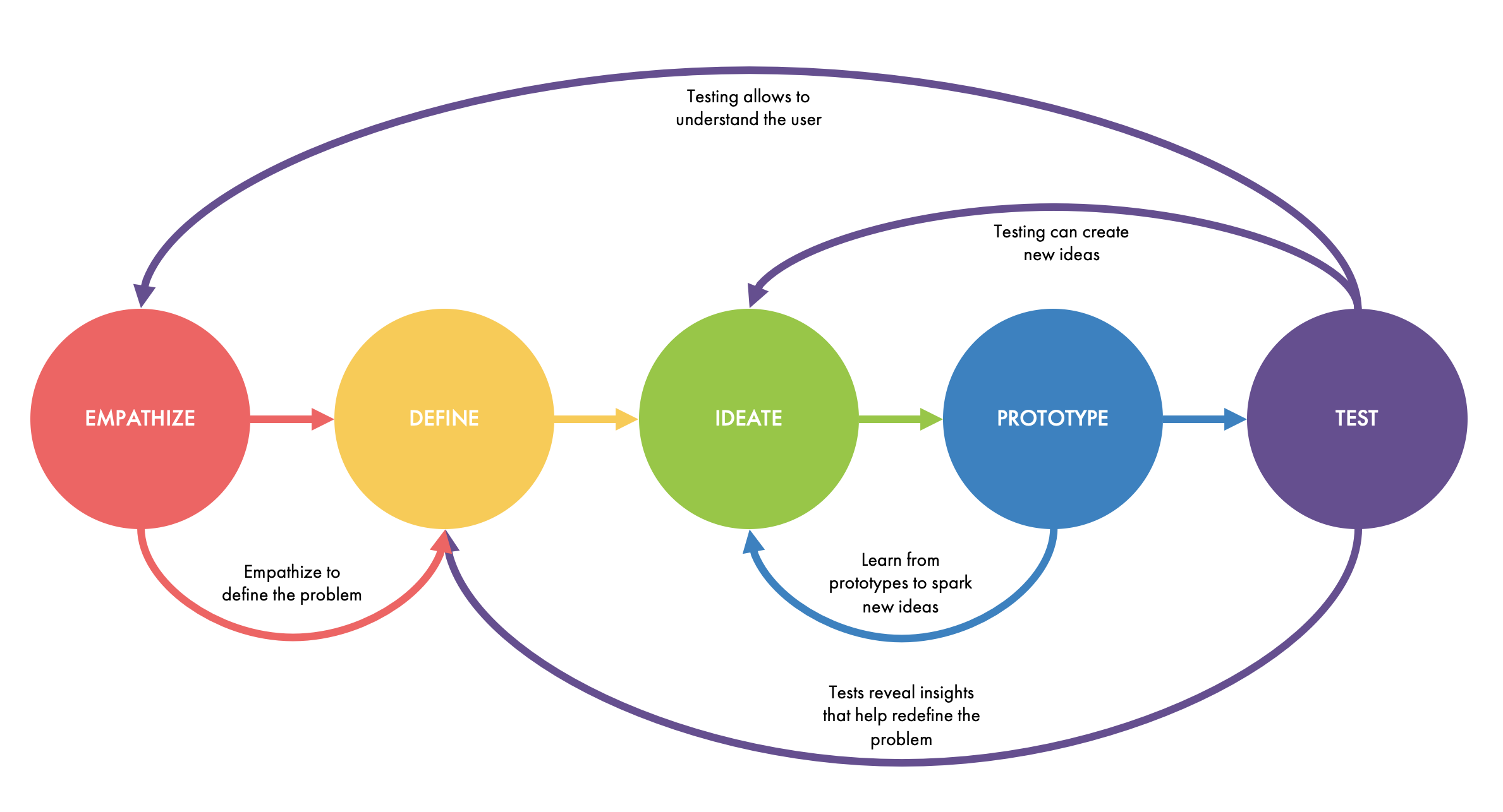
For this project I found the Design Thinking methodology to be particularly useful since I wasn't familiar with the overall technical implications of the subject.
My research consisted of:
- Conducting interviews with the radar engineers to understand the technology behind our service
- Researching competitor products
- Understanding the user needs and knowing who the decision-makers are for this type of application
- Leading Design Thinking workshops with the team in order to get insights from co-workers with a broad range of knowledge and different (technical) backgrounds
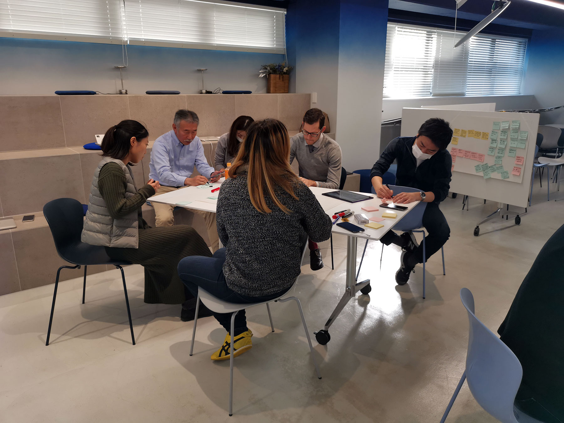
Design Thinking workshop for Land Displacement monitoring at our company HQ
Ideation
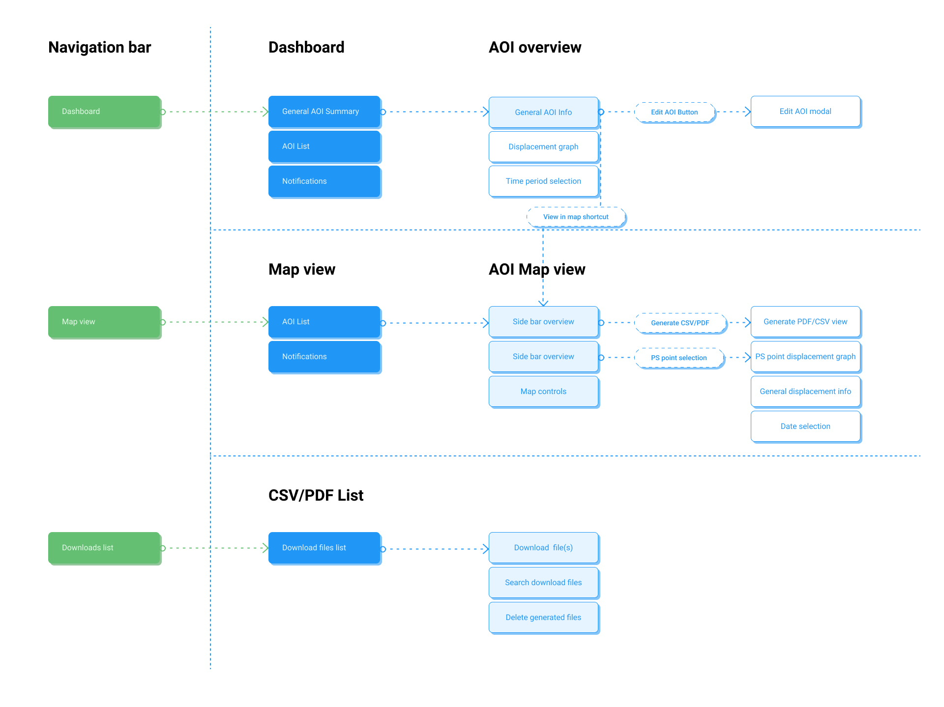
After gathering all the information from the research and workshops a general user flow for the solution was created in order to clarify how the users will navigate through the solution.
After confirming the overall flow with the team and stakeholders I created some wireframes to outline the overall layout of each screen.
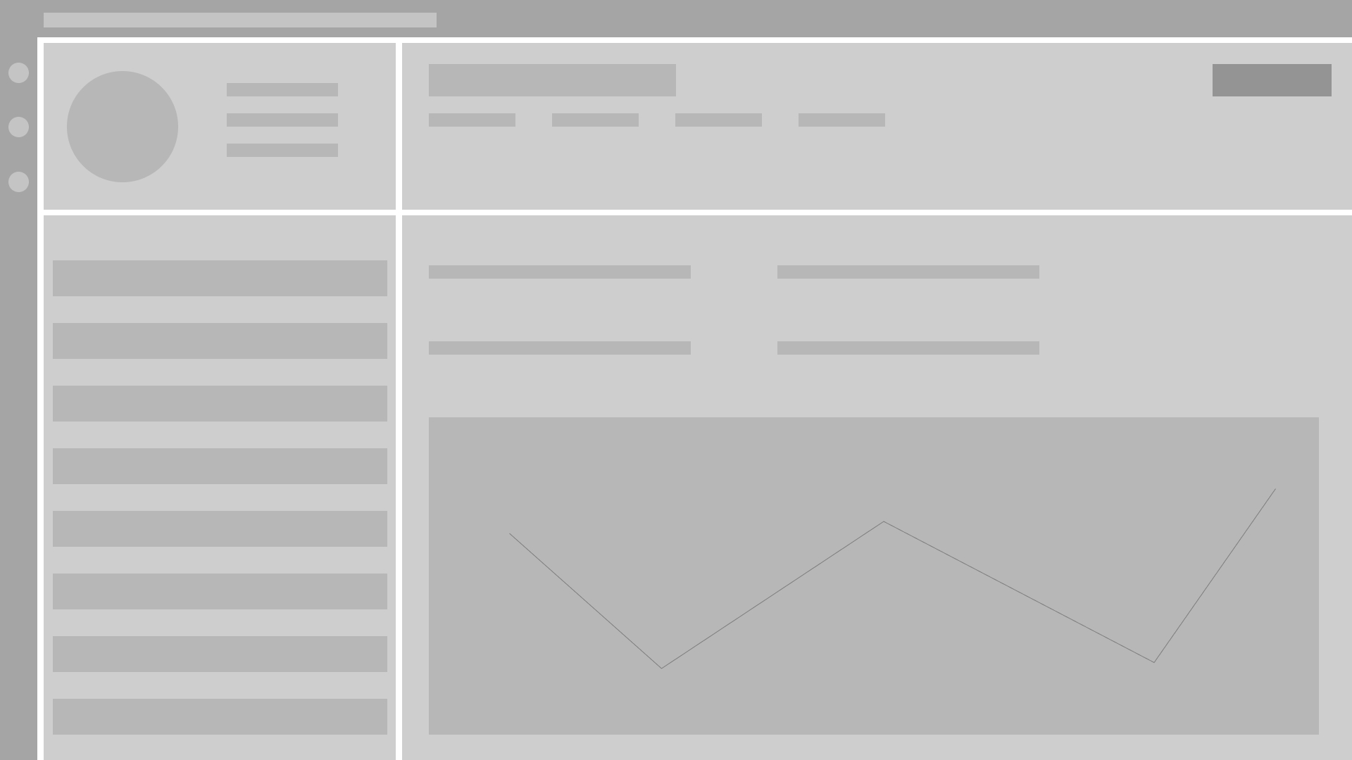
Dashboard wireframe
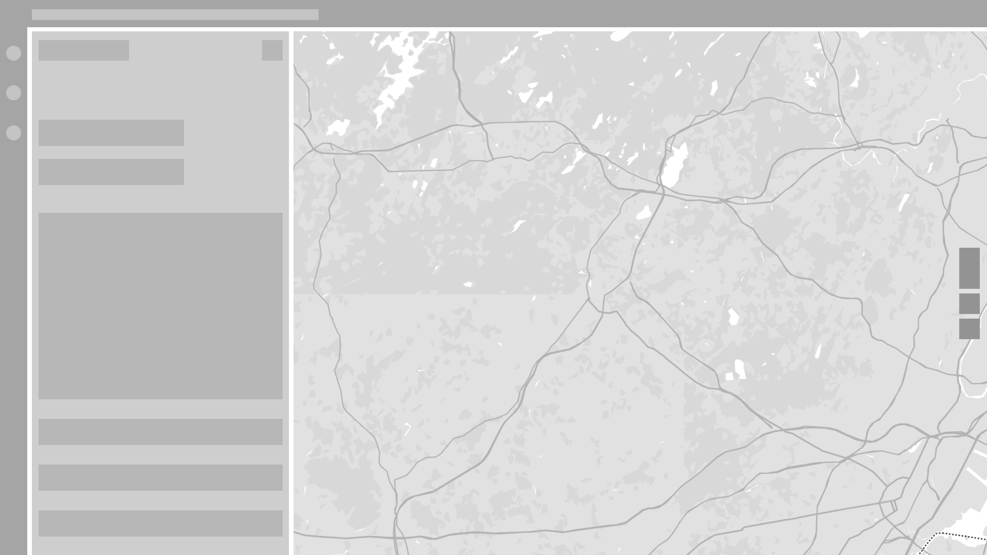
Map view wireframe
Design
The main goal of the LDM design is to make it accessible even to users with little to no technical background in engineering or geology. After talking to our customer solution engineers it was clear that depending on how bad the land displacement is, the user needs to be able to act quickly and see in an instant what area is mostly affected by sinking grounds.
For this I created a simpletraffic light system that visulizes any problematic areas clearly. With this the user can instantly see the most dangerous areas or the ones they need to keep observing in the near future.

#24A148

#F1C21B

#DA1E28
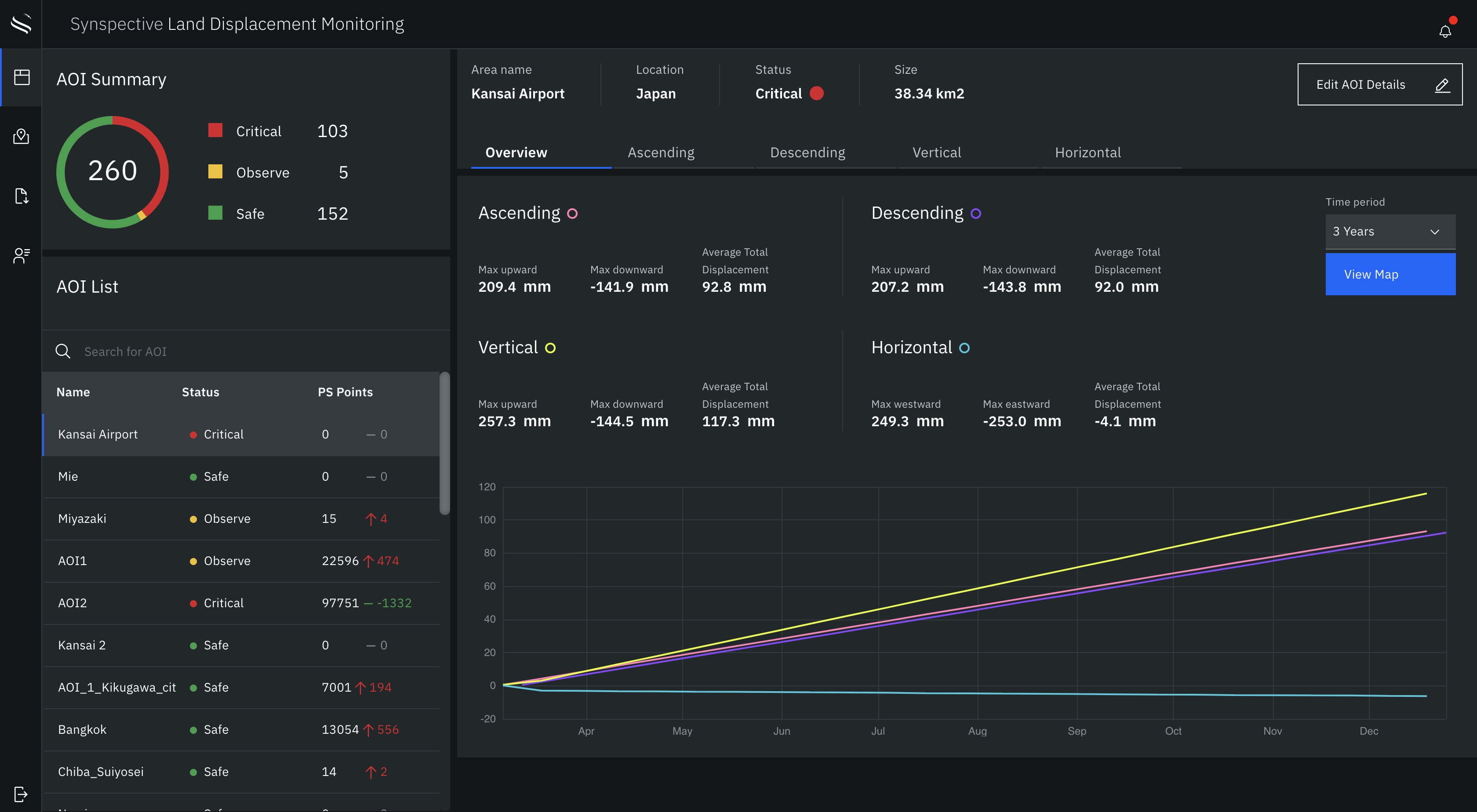
The dashboard offers a quick overview of all the areas of interest that the user has access to. The charts help to understand how the overall displacement of the observed area has been going over a specific period of time.
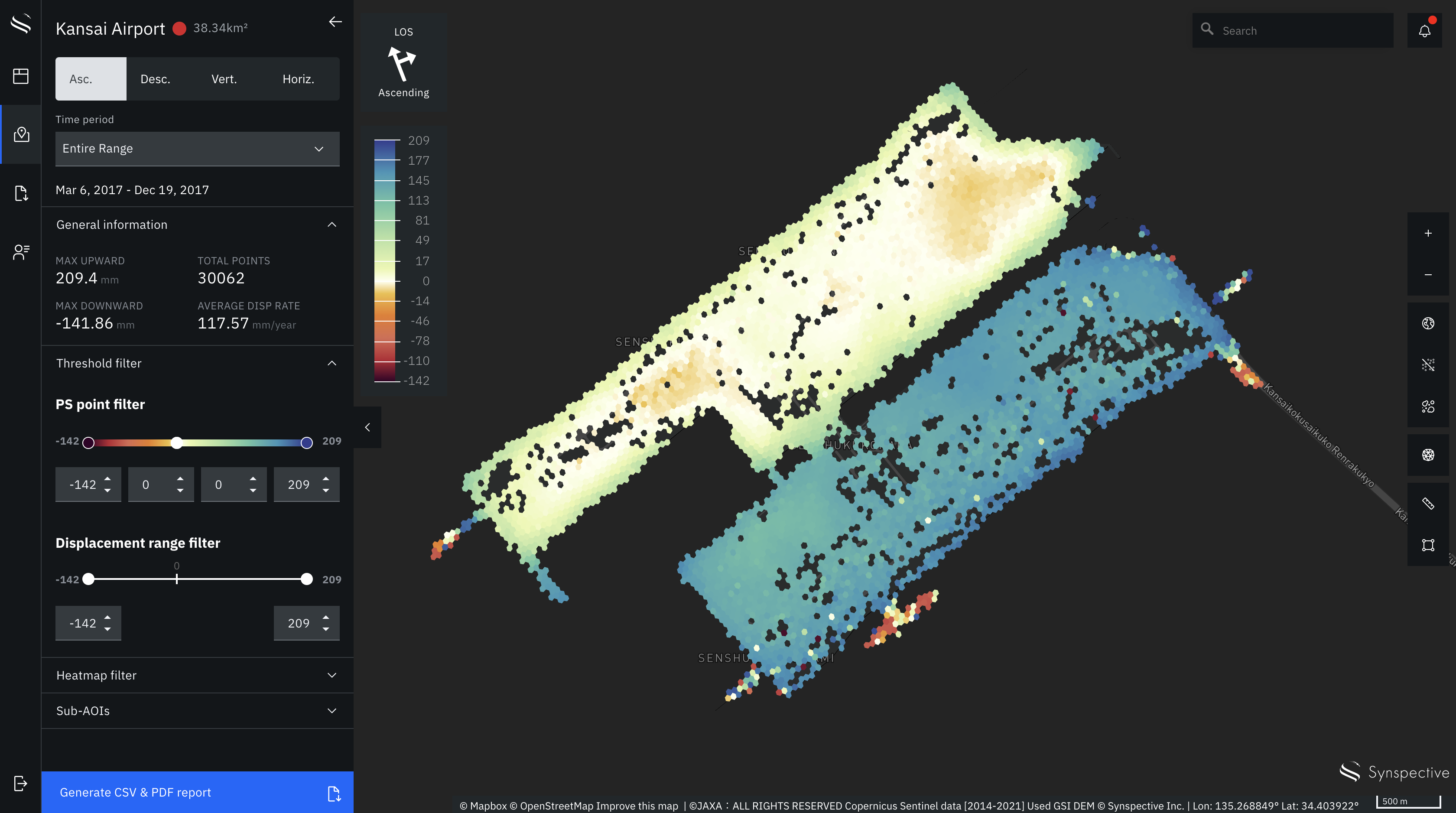
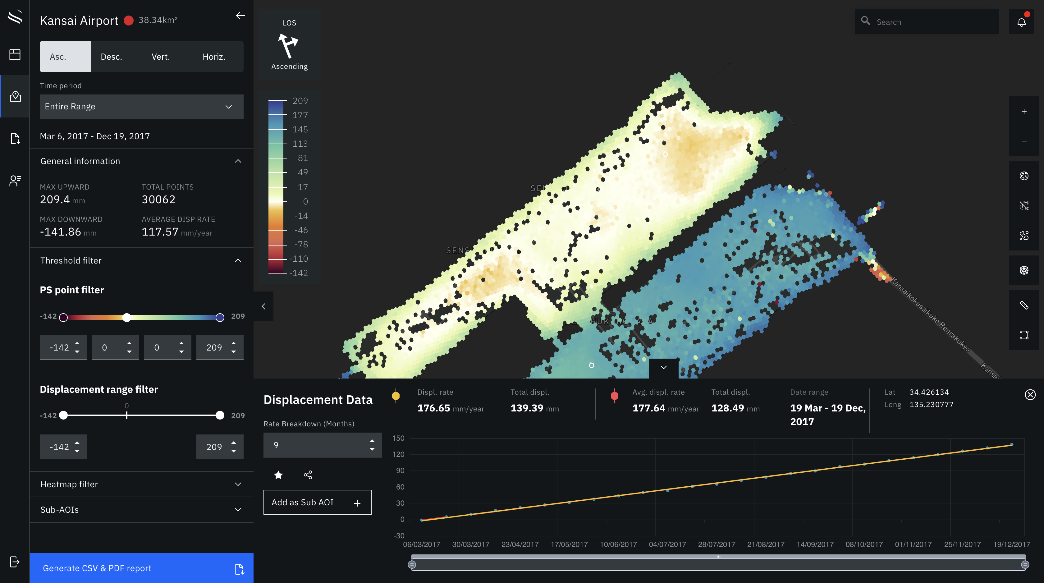
The map view of the area shows the actual land displacement in a variety of visualizations. The heat map, for example, highlights areas with a strong downward (orange and red) and upward (green and blue) land displacement.
In addition, the user can select points on the map in order to get more detailed insights on the displacement of that specific point (line chart view).
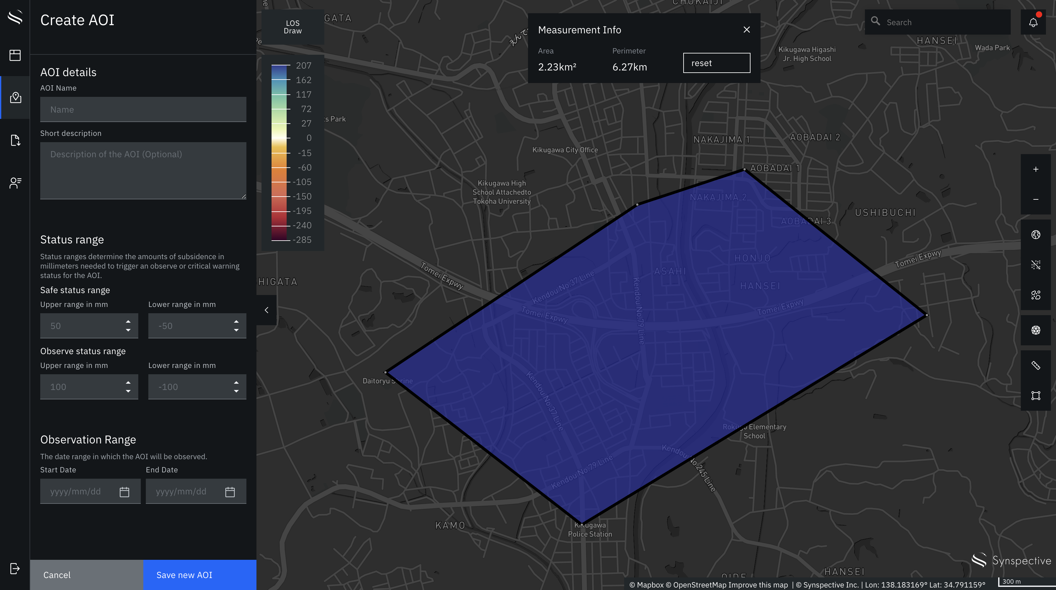
Users can create their own AOIs right inside the application. The flow is simple and doesn't require specific technical knowledge and is therefore accessible for other decisionmakers like construction managers, architects or government officials/
See more work

Synspective - Brand GuidelinesArt Direction / Design
Active ConnectorArt Direction / Design
LunarisBrand Identity
KomadoBrand Identity

Samuel Alexander AW Collection 2019Photography
Neon DreamsPhotography

Samuel Alexander SS Collection 2019Photography
HUAWEI Mate 20 Pro CollaborationPhotography
SAVEUR: Japan's Bread ShokuninPhotography