RECRUITING COMPANY WEBSITE
Active Connector
Art Direction
User Research
Design
Active Connector is a Tokyo-based recruiting agency led by an international team who is specialized in recruiting young job seekers from overseas who are looking for purpose and meaning in their work. Their main focus for recruitments is in engineering, tech, or business development positions.
The goal for this project was to redesign the website to
make it appealing to a young audience mostly composed of fresh graduates and reduce bounce-off rates by offering features and services that users usually can't find on other job-hunting websites.
User Research
In order to understand Active Connector's actual target audience, we did some user persona sessions with the managers. With this approach, I was able to understand the needs of potential users and also how Active Connector wants to differentiate itself from its competitors.
Max (24)
Fresh University Graduate

Goals
- Find a possibility to work abroad and gain experience he wouldn't get in his home country
- Work in an environment that values his skillset
Frustrations
- Language barrier
- Lack of work experience
- Not knowing where to look for jobs in Japan
Lisa (29)
Full-Stack Developer

Goals
- Switch career paths by finding work in another country i.e. Japan
- Learn a new language and culture in an unfamiliar work environment
Frustrations
- Uncertainty if career change will benefit her
- Most recruiting services don't feel personal enough
Sebastian (34)
Business Strategist

Goals
- Wants a new job abroad that gives him a purpose in life
- Looking for a visa and possibilities to settle in Japan
Frustrations
- Difficulties to apply for jobs that don't seem relevant to his experience
- Fear of rejection by potential employers due to language barrier
Brand Elements
The created personas show that most potential users are between 20 and 40 years old resulting in an audience that can be considered as "young adults". Therefore it was important that this was also reflected in the look and feel of the website.
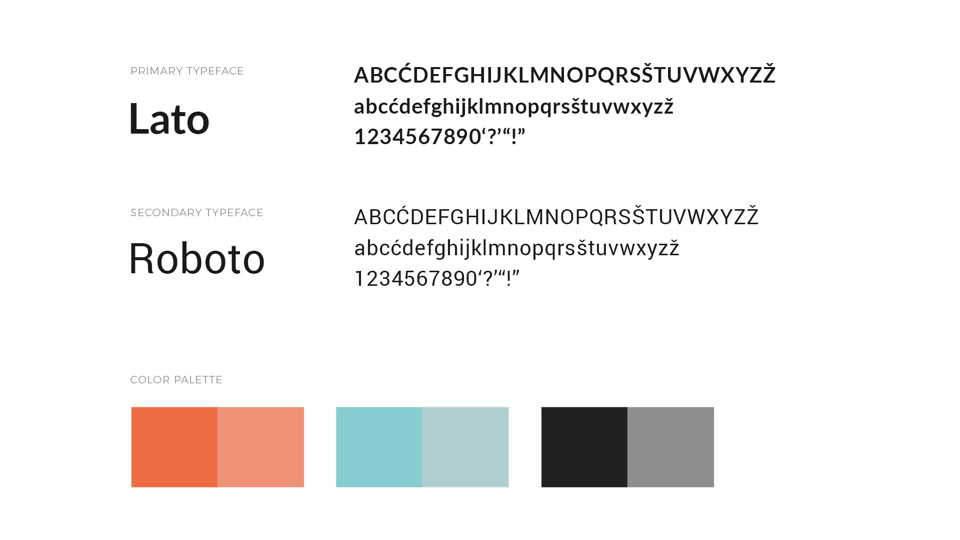
The colors of the new website were based on the orange logo of Active Connector.
This orange and blue theme help to create contrast between each section while also looking clean and modern. In addition, the colors are supposed to communicate trust and warmth. One of the other goals of the redesign was to clearly distinguish Active Connector from their competitors who often have very cold-looking corporate websites.
The visual language for the website is meant to convey a sense of exploration of new opportunities and personal fulfillment that is waiting for people who are looking to find work in Japan.
The visual language (particularly the photography) of the website is meant
to convey a sense of exploration of new opportunities and personal fulfillment that is waiting for people who are looking to find work in Japan.

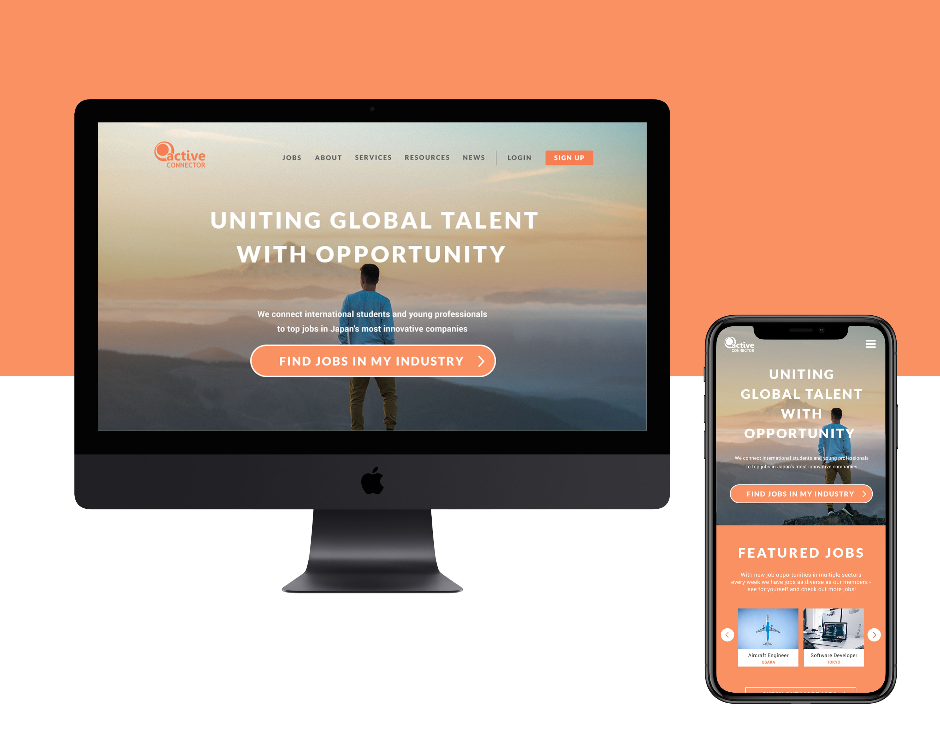
Landing page design (desktop + mobile)
Full Landing Page
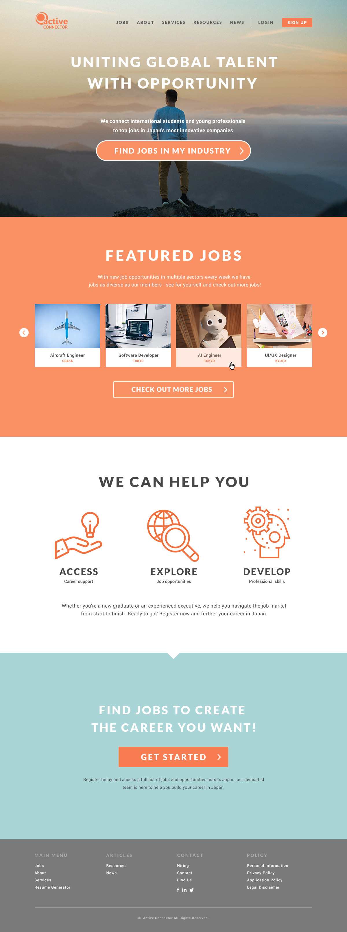
The landing page was designed in a way that helps the user to find right away what they are looking for. One of the main problems that Active Connector was encountering with their previous website was the high bounce rate because the main content (job offers) was buried under unnecessary content.
By featuring a large CTA button and popular jobs at the top of the page the interest of website visitors is caught right away.
After the redesign, bounce rates have been reduced by more than 45%.
About Us Page
In order to increase the connection with potential job seekers, the company wanted to give itself a face so that people feel more confident that they can trust them. Every recruiter has a personal introduction page so that users can learn more about who they might be talking to when looking for job opportunities in Japan.
The result of the user persona research showed, that a lot of potential job seekers feel left alone or are frustrated with the way recruiting companies feel impersonal and cold. By showing their face and introducing each recruiter with a profile, the connection can feel more direct and personal. It is as if the user gets his own coach for job hunting in Japan.


See more work
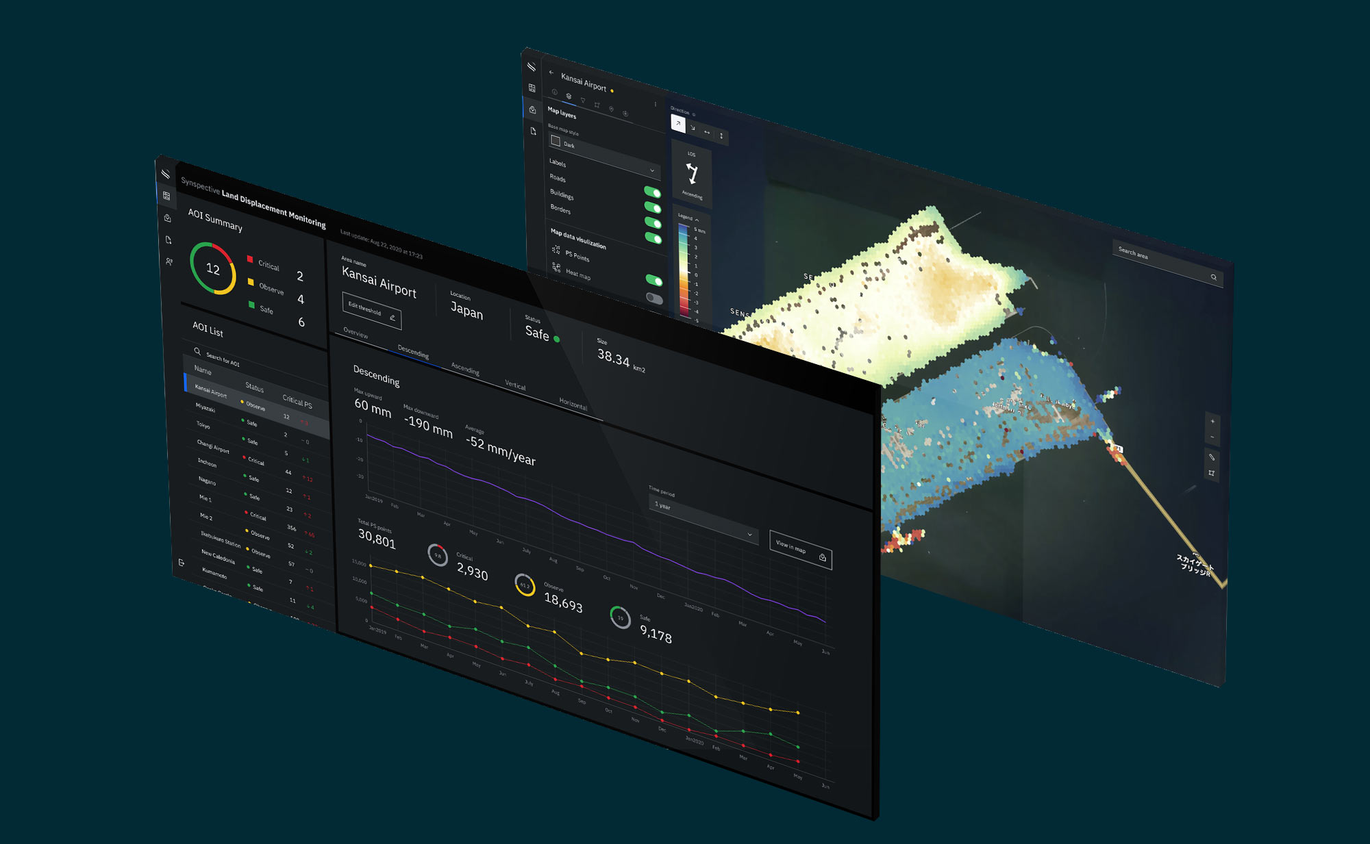
Land Displacement MonitoringUI/UX Design

Synspective - Brand GuidelinesArt Direction / Design
LunarisBrand Identity
KomadoBrand Identity

Samuel Alexander AW Collection 2019Photography

Neon DreamsPhotography

Samuel Alexander SS Collection 2019Photography
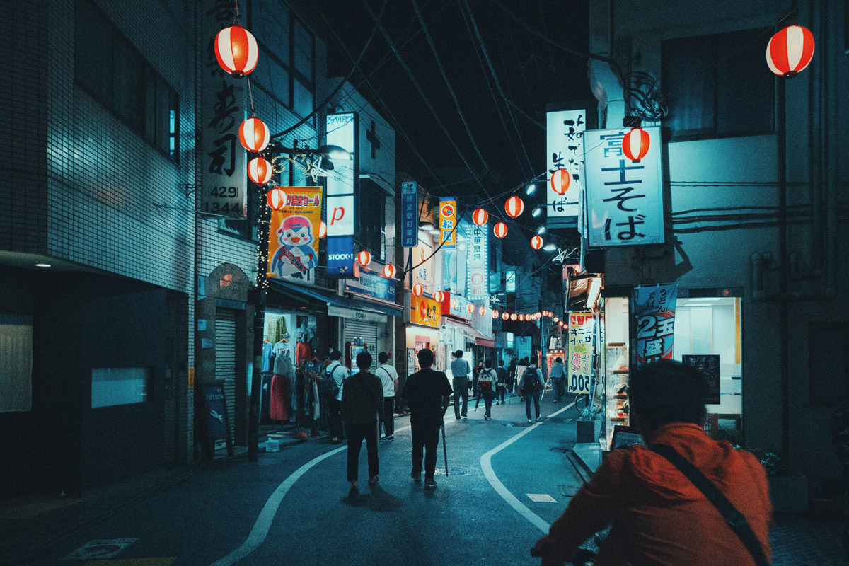
HUAWEI Mate 20 Pro CollaborationPhotography

SAVEUR: Japan's Bread ShokuninPhotography