E-COMMERCE WEBSITE BRAND IDENTITY
Komado
Art Direction
Design
Photography
KOMADO is a Japanese e-commerce website selling premium housewares mainly from Europe. The goal of this design project was to create a brand identity that speaks to a Japanese audience that values craftsmanship and high-quality products from overseas and that is willing to afford luxury goods for their home. The word "Komado" in Japanese means "small window".

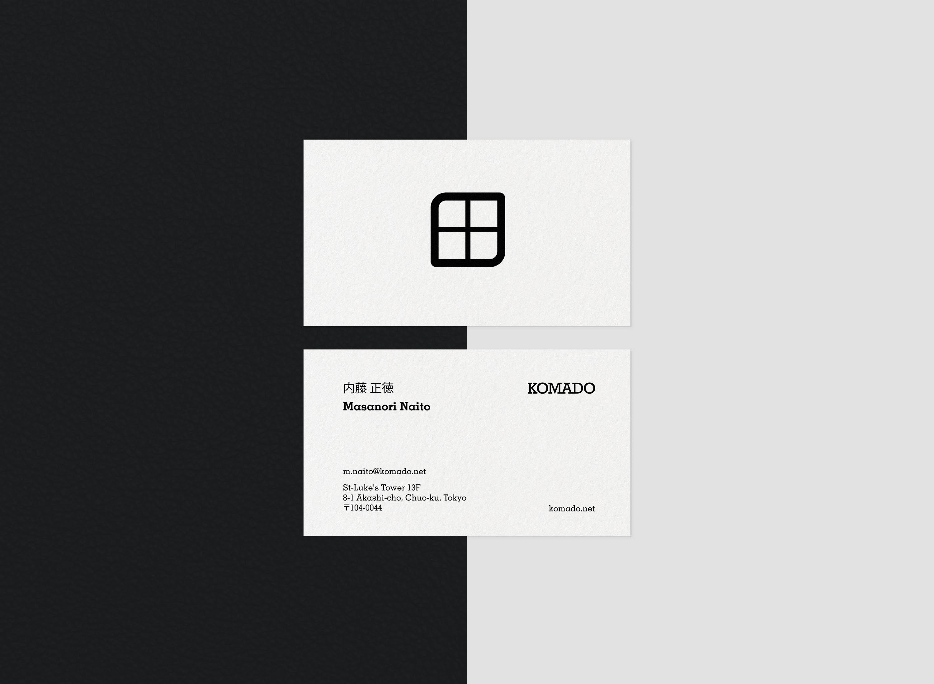
Logo Design
The logo was inspired by the shape of small rectangular windows as you can find them on traditional Scandinavian houses since many oft he high-quality products on Komado's website come from Norway and Finland.

Business Cards
The business card was kept minimalistic on purpose in order to respect Japanese aesthetics as well as the minimalism in Scandinavian design.
It was printed on rough paper with a felt-like texture to reference the craft-oriented products of the business.
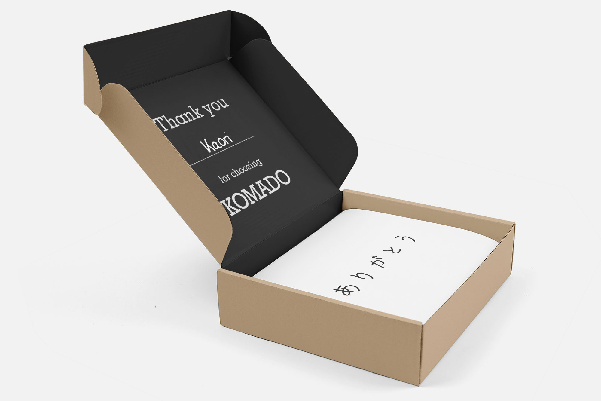
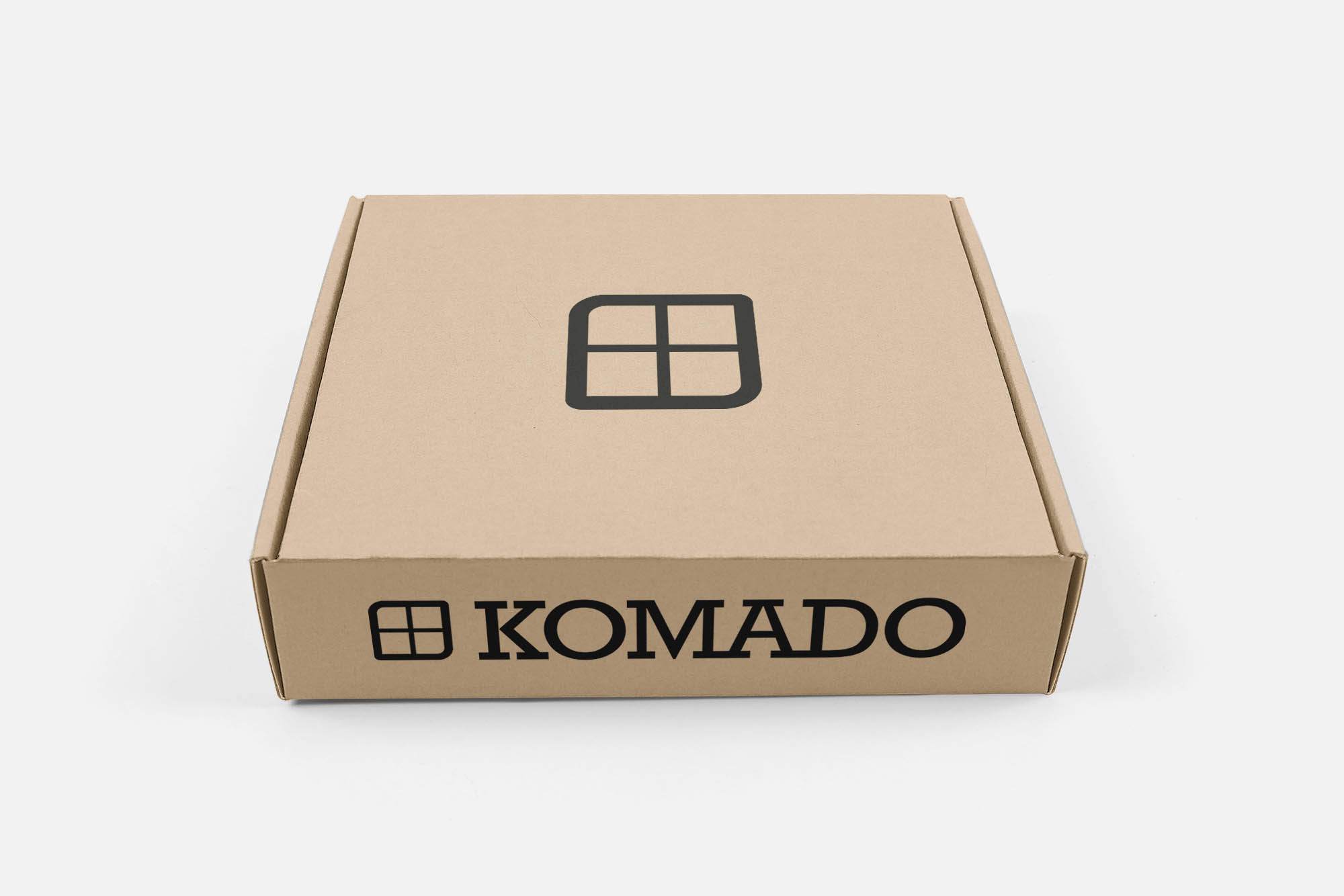
Mailing Box
The inside of the mailing box has a line where the customer's name is written on by hand.
This makes a simple mailing box more personalized and is supposed to increase the customer's loyalty.
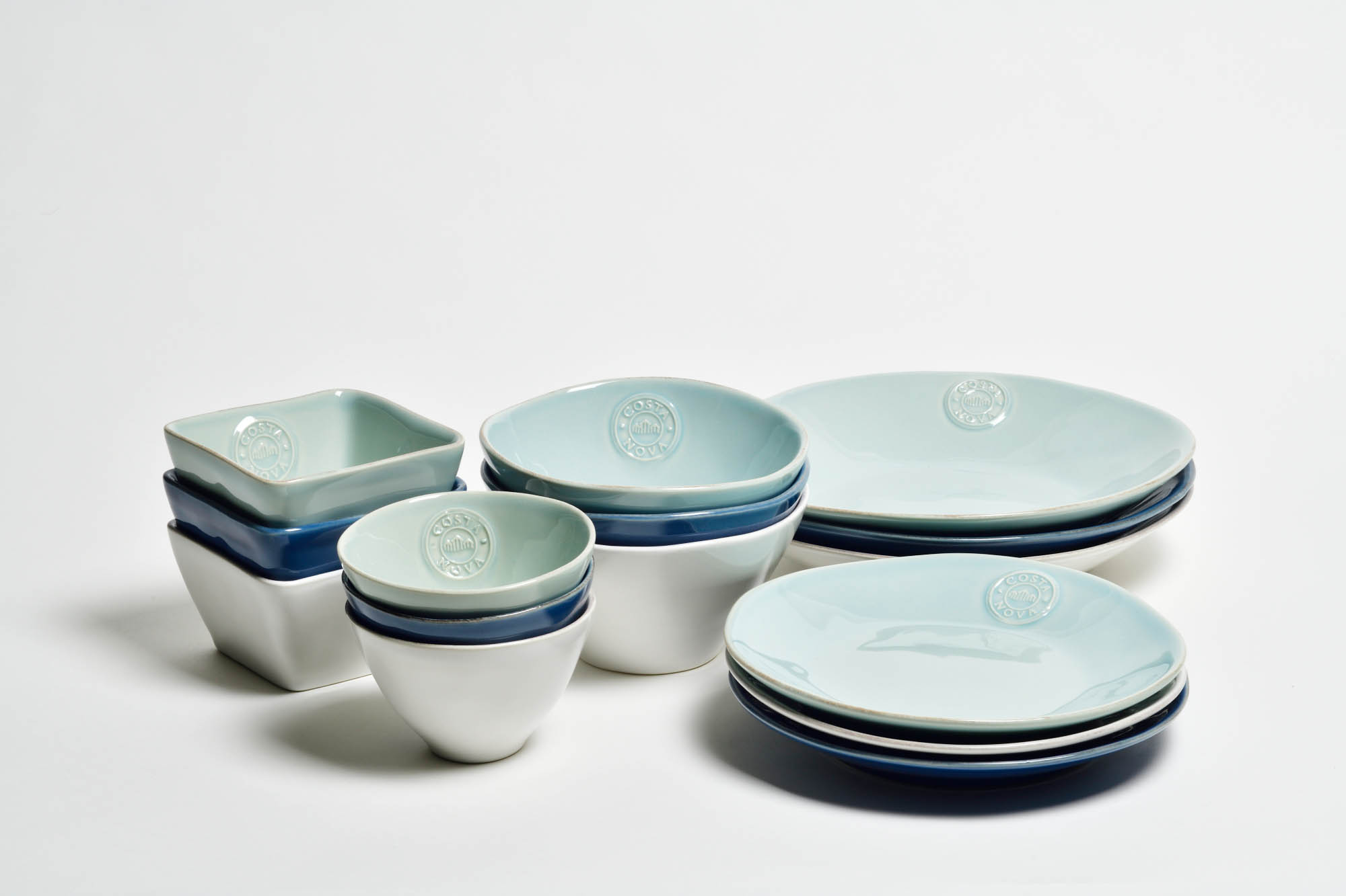
Product Photo
See more work

Land Displacement MonitoringUI/UX Design

Synspective - Brand GuidelinesArt Direction / Design

Active ConnectorArt Direction / Design
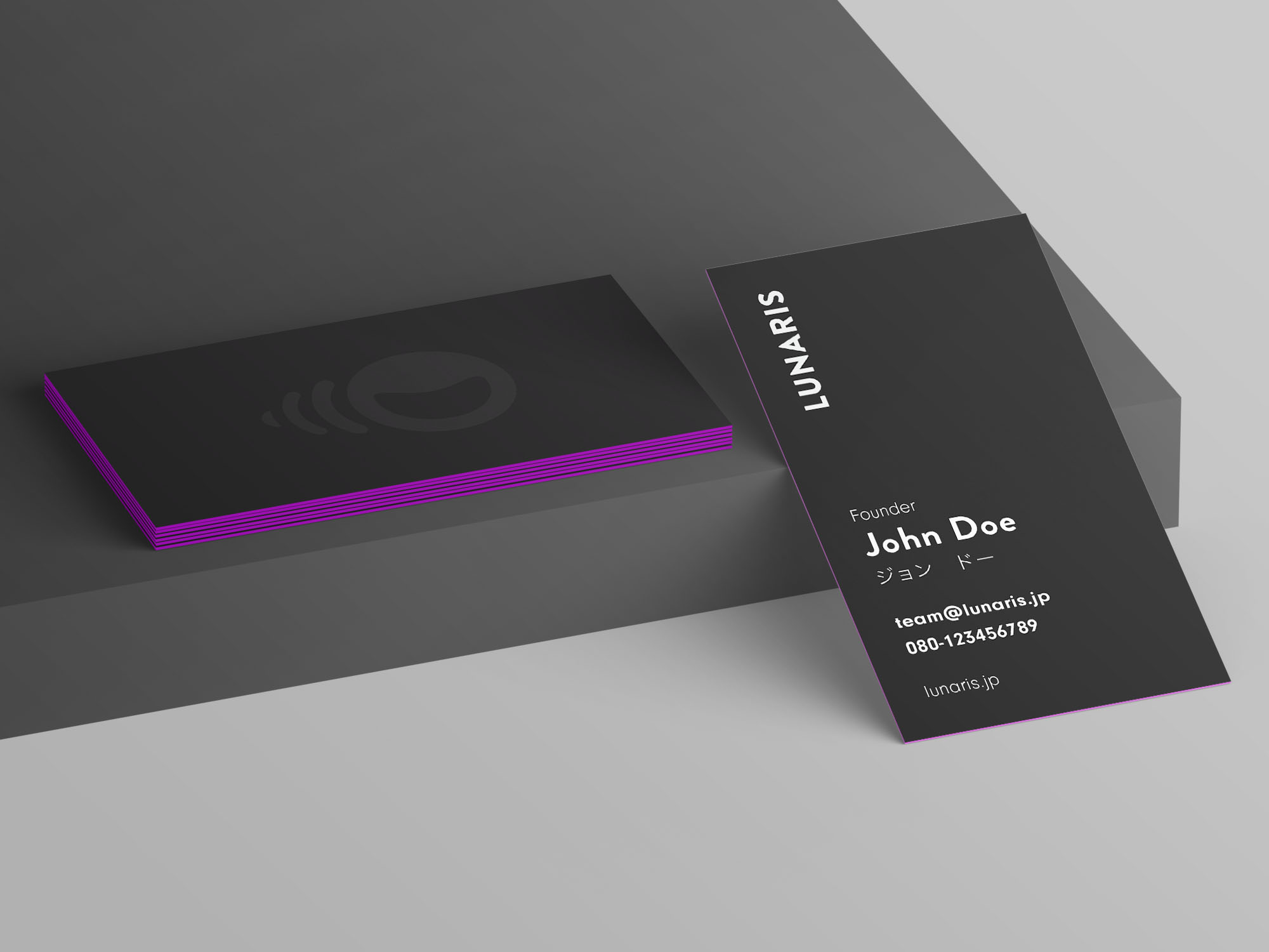
LunarisBrand Identity

Samuel Alexander AW Collection 2019Photography

Neon DreamsPhotography

Samuel Alexander SS Collection 2019Photography

HUAWEI Mate 20 Pro CollaborationPhotography

SAVEUR: Japan's Bread ShokuninPhotography